There are a few reasons why Automatic.css is fundamentally different (and preferential) from other utility class systems. It's important to understand these differences before trying to use the system.
It doesn't do too little. Most utility systems force you to use classes for everything. Automatic.css picks up the slack by automatically setting certain elements like heading sizes, section padding, etc. by default (without overdoing it). You don't have to remember to put a class on every single heading or section.
It doesn't do too much. Many utility class systems try to do way too much with hyper-granular, obscure classes like ".pt-10", which make your website harder to maintain and harder to adjust globally. Automatic.css is designed to help where necessary without trapping you in Utility Class Hell.
It keeps up with you, even when you go custom. One of the biggest downsides of most utility class systems is that you have to leave them behind when you create custom elements. With Automatic.css variables you can easily hook custom classes into the Automatic.css sizing, spacing, and color systems for unprecedented design consistency.
It's automatic, but it gives you extreme control. Other utility class systems lock you into set variables and making changes is time consuming and risky. Automatic.css is the first system that empowers you to dial in the entire system to your specific design needs. From site to site, Automatic.css follows your lead.
It doesn't try to do everything. Since Automatic.css stays true to being a utility system, it's free of the bloat that comes with many other utility class frameworks. And yes, we guarantee that we'll stick to a utility-first philosophy to ensure that Automatic.css will never fall victim to the bloat of endless feature requests and chintzy add-ons.
It's built for actual devs. Relying on the pre-styled layout packs and design kits that come with other utility systems is boring and traps you and your client into a website that looks like all your other websites. Automatic.css is built for people who build from scratch, use custom classes appropriately, and who want to be able to quickly and easily create ... anything. Of course, it's still super easy for beginners to learn and use.
The visual result may look the same, but what's happening under the hood is far more advanced. Automatic.css uses very unique and advanced CSS techniques relative to other frameworks in order to provide extreme consistency and responsiveness in addition to customizability. While it might seem like a color class is a color class and a padding class is a padding class, once you fully understand the system you'll see why Automatic.css is so different and so powerful.
Key Benefits and "Automatic" Features...
Automatic.css offers a number of benefits over other frameworks. Here are some highlights:
No Unpredictable Styling
Many utility class frameworks are also based on design sets. Therefore, they include additional unexpected styling on certain elements. For example, buttons may have shadows, borders, hovers, etc. This creates a situation where styles have to be removed before the system can be useful from a custom build standpoint. Automatic.css does not apply unpredictable styling – it applies the exact styles you'd expect it to and nothing else.
It's Based On Your Website's Actual Dimensons
Automatic.css is automatically responsive. No breakpoint adjustments are necessary, making it the easiest utility framework to setup, customize, and maintain.
But wait! It gets better...
Unlike other frameworks, Automatic.css's text and spacing responsiveness isn't based on arbitrary values. It calculates the accuracy of the responsiveness based on your website's actual max width and a minimum device width.
If your website width changes, or you want to change the minimum device width you're optimizing for, Automatic.css recalculates the responsiveness automatically.
This makes Automatic.css the most accurately responsive utility framework available.
Viewport dimensions are set by default, but can be overridden in the plugin dashboard.
The Root Font Size is User Adjustable
We're big fans of setting the root font size to 62.5% because it makes using rem values (the most predictable and accessible value) extremely intuitive (1rem = 10px).
With that said, we know that 62.5% isn't everyone's preference. It can also cause problems when trying to add the framework to a site that's already using rem values based off a 16px or 100% root font size.
Therefore, we designed Automatic.css to be one of the only frameworks that allows you to set the root font size to your preferred value. The entire system will re-calculate itself to your preferred root font size.
Perfect Typography
Automatic.css's typography system controls the font size of headings and text across your site.
All headings and text are automatically responsive and unlike with other frameworks, text sizes in Automatic.css follow a perfect mathematical scale.
In the dashboard, you'll find a scale selector with 8 different popular scales to choose from. You can also set your own scale if you'd prefer.
Regardless of which scale you choose, Automatic.css will automatically re-calculate the responsive nature of the text. It's "set it and forget it."
You also have the option to set a different scale for mobile devices. This is perfect for websites that prefer a more extreme scale on desktop, but want to tighten the variations between sizes on mobile.
If you want to go completely custom, you can override the Automatic.css scale system and set your own minimum and maximum sizes for each text size. And yes, your custom text sizes will still be responsive without any additional effort.
In the near future you'll be able to quickly and easily add custom sizes to the scale as well as custom sizes that work independent of the scale.
A Powerful Color System
Automatic.css has a powerful color system. It allows you to set your website's colors and then automatically generates multiple light and dark shades of each color as well as a range of opacities.
Your colors, as well as the automatically generated shades and opacities, can be used throughout your site, either with classes or variables. This means the color system can be used on any element that accepts a color value, whether it's a background, border, button, text, link, span, pseudo-element, or anything else.
Need to adjust one of the shade's lightness values? Each shade's lightness value can be overridden in the dashboard.
The Colors
There are 5 editable default colors in the Automatic.css system:
Primary Your website's action color (buttons, links, etc.)
Secondary Your website's secondary color
Accent Your website's least used color
Base Your website's preferred neutral color
Shade Neutral grey shades
The Shades
The following shades are generated for each color:
ultra-light
light
medium
dark
ultra-dark
comp (the color's complimentary color)
The Opacities
The following opacities are generated for each color:
5%
10%
20%
40%
60%
80%
90%
95%
What happens if I change a color later, after I've already used all the shade classes and variables throughout the site?
That's the beautify of Automatic.css. Any change made in the dashboard is a global change that will automatically refactor across the site. That includes all generated shades and opacities.
It gets better: We're hiring an expert in color theory to help us take the Automatic.css color system to the next level: adjusting saturation values along with lightness, generating entire palettes based on popular color systems, and generating contrast warnings for accessibility.
A Perfect Spacing System
As is true of the Automatic.css typography system, the spacing system is automatically responsive and follows a perfect mathematical scale. This ensures that spacing across your website is extremely consistent on any device size.
You have full control over the mathematical scale. You can also set a different scale for mobile devices (for example: if you prefer more white space and larger variations between spacing sizes on desktop but much tighter spacing and less variation on mobile).
Additionally, there's a "base space" value from which the entire spacing system is initially calculated. By changing the base space value, you can control spacing across your entire site in an even fashion.
Section Padding
Padding for sections is different than padding for other elements in two ways:
Sections require more padding than other elements in order to create an appropriate design flow.
We must be able to add top/bottom padding in sections without adding left/right padding.
To account for this, Automatic.css has dedicated section padding classes and variables. The section padding is generated from a multiplier of the regular spacing system. This means (1) it follows the same mathematical scale (2) you have full control over the base spacing of sections.
You can also set a different base spacing for sections on mobile devices if you prefer tighter section padding on mobile.
Header Padding
Similar to section padding, headers require top/bottom padding without affecting left/right padding. The only difference is that they don't demand as much padding as sections do.
Automatic.css has dedicated header padding classes and variables that follow the same mathematical scale and base space values as all your other spacing for ultimate consistency.
Variable Hooks
Another unique feature of Automatic.css are variables that allow you to hook into the Automatic.css system when creating custom classes or styling an element at the ID level.
When using other frameworks, you often have to abandon the framework completely when creating a custom element because there's no way to tie in the values of their classes to your custom elements.
Think about creating a fancy custom card. While the framework you're using may use clamp() in their heading and text classes, there's no way to access the clamp() functions for your custom card heading and text.
Even if you could access and paste in the clamp() functions, it's now a static value that can't be edited globally. If the clamp values need to change in the future, you have to go change them everywhere you created something custom. If you have custom buttons, cards, etc. that can be a lot of places!
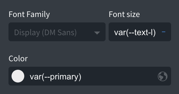
With Automatic.css, none of that is necessary. You can create custom elements with ease by referencing Automatic's variables:
Example Usage & Benefits
So if you want to hook into Automatic.css' "L" text size, you can simply write var(--text-l) in the font-size field.
You could create a hundred custom elements this way and if your typography ever needs to change in the future, you can change it in your dashboard and you'll NEVER have to go edit these custom elements individually.
All of the critical parts of Automatic.css are accessible with variables: text sizes, spacing, colors, shades, opacities, border radius, etc.
While it takes a couple days to get used to using variables, you'll wonder how you ever lived without them once you get the hang of it.
Automatic ... GRIDS.
Build a grid in another framework. You start by defining how many columns it'll have on desktop. Then you have to define how many columns at the XL breakpoint, and how many at the L breakpoint, and how many at the M breakpoint, and S breakpoint. You get it.
It's tedious.
Now, I don't want you to worry. Automatic.css provides this functionality if you love extra work (okay, okay ... sometimes you need that kind of control). However...
Automatic.css also provides automatic grids. You simply define the number of columns on desktop and the grid is automatically responsive from that point down without needing a single breakpoint class.
Conventional automatic grids (equal columns) are provided as well as automatic special grids (1-2, 3-2, 1-3, etc.).
These automatic grids are possible because they're calculated from your custom viewport variables.
Dual-Layer Fallbacks
Automatic.css uses advanced CSS techniques to make the system automatic. While these techniques are supported across all modern and up-to-date mainstream browsers, they're not backwards compatible with older versions of these browsers or many older devices.
To ensure that your site still functions properly and looks okay on older systems, we've installed two separate fallback layers inside Automatic.css.
The first fallback layer is for browsers that don't support clamp() functions. Clamp() is used for all responsive spacing and typography across the site.
If a browser doesn't support clamp(), we created a unique fallback that uses calc() instead, and produces surprisingly accurate results (Automatic.css is the only fluid typography system that does this, so your custom fluid typography will be available on more browsers than ever before).
You will likely not notice any difference when viewing your website on a browser that supports clamp() versus a browser that only supports calc().
The second fallback layer is for browsers that don't support clamp() or calc(). This would be much older browsers that are still in circulation on older devices. As a percent of market share, it's a very small user base.
If a browser doesn't support clamp() or calc(), we use pure rem units. This is a completely manual fallback layer. We have the default values set to follow a mathematical hierarchy with the largest XXL unit still being small enough to display fine on mobile devices.
The main goal of this 2nd fallback layer is NOT to try and replicate the look and feel of your primary design – it's simply to ensure that the typography and spacing across your site doesn't look broken on older devices. It's a "Plan C" emergency fallback, not a desired outcome.
In any case, you have full control over the fallback values via the plugin dashboard should you wish to change them.
Having fallbacks done for you as part of this system – and having the fallbacks adapt to any changes you make within the system – is a MAJOR advantage to both your workflow and the end result of your projects.
And yes, there's more. It's no surprise that once people have used Automatic.css on a build they can't stand editing websites that use any other framework. It's a truly delightful experience.