
First published May 16, 2024, by Miles Mathis
I hadn't intended to comment on this, since there isn't much left to say regarding the vulgarity of Modernism and the Phoenicians.
I have said it all before many times.
A reply to an ARTnews article on the artist Jenny Saville by the artist Miles Williams Mathis (mileswmathis.com)
However, my younger or newer readers may not have heard it, so for their sake I am here once again.
First things first:
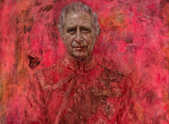
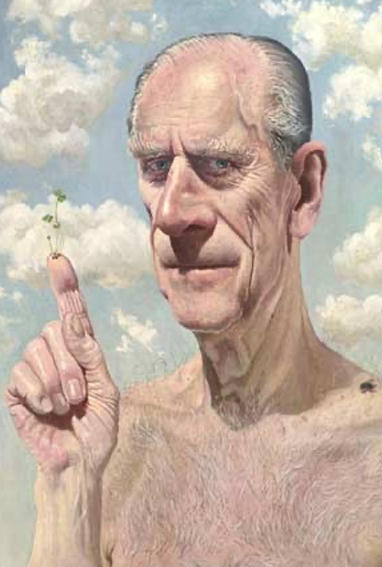
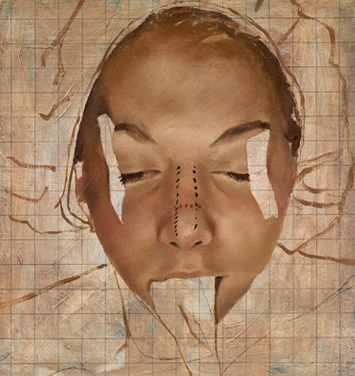
Some outlets led by calling this a self-portrait, which means people just don't know anything about art or the dictionary anymore.
For it to be a self-portrait, Charles would have had to paint it himself.
It is just a portrait.
Charles is an amateur painter, but he doesn't paint portraits.
Jonathan Yeo is claiming it took him three years to paint this.

Jonathan Yeo (born 18 December 1970,) is a British artist of contemporary portraiture who was educated at Westminster School. He rose to prominence for having painted Kevin Spacey, Dennis Hopper, and Cara Delevingne, among others. GQ described him as "one of the world's most in-demand portraitists."
If so, he must have spent about 3 seconds on it each day.
Although it is large, I could have painted this in about a week, not that I would have.
The face is the only thing that would take any time, but even so that is just a few days' work.
The rest could be slapped on in a matter of hours.
Because the style of the face doesn't match the rest of it, my guess is Yeo hired out the face and maybe painted the rest of it himself.
That is now common at the upper end of Modernism, see for example Damien Hirst, who is known to hire out any real painting to specialists.

Damien Steven Hirst (/hɜːrst/; né Brennan; born 7 June 1965) is an English artist and art collector. He is one of the Young British Artists (YBAs) who dominated the art scene in the UK during the 1990s. He is reportedly the United Kingdom's richest living artist, with his wealth estimated at US$384 million in the 2020 Sunday Times Rich List. During the 1990s his career was closely linked with the collector Charles Saatchi, but increasing frictions came to a head in 2003 and the relationship ended.
The modern artist is only an idea-man.
Others have said the head is better than the rest of it, but even it isn't good.
It is the standard Modern uglification, a la Lucian Freud.

Lucian Michael Freud OM CH (/frɔɪd/; 8 December 1922 – 20 July 2011) was a British painter and draughtsman, specialising in figurative art, and is known as one of the foremost 20th-century English portraitists. He was born in Berlin, the son of Jewish architect Ernst L. Freud and the grandson of Sigmund Freud. Freud got his first name "Lucian" from his mother in memory of the ancient writer Lucian of Samosata. His family moved to England in 1933, when he was 10 years old, to escape the rise of Nazism. He became a British naturalized citizen in 1939. From 1942 to 1943 he attended Goldsmiths' College, London. He served at sea with the British Merchant Navy during the Second World War.
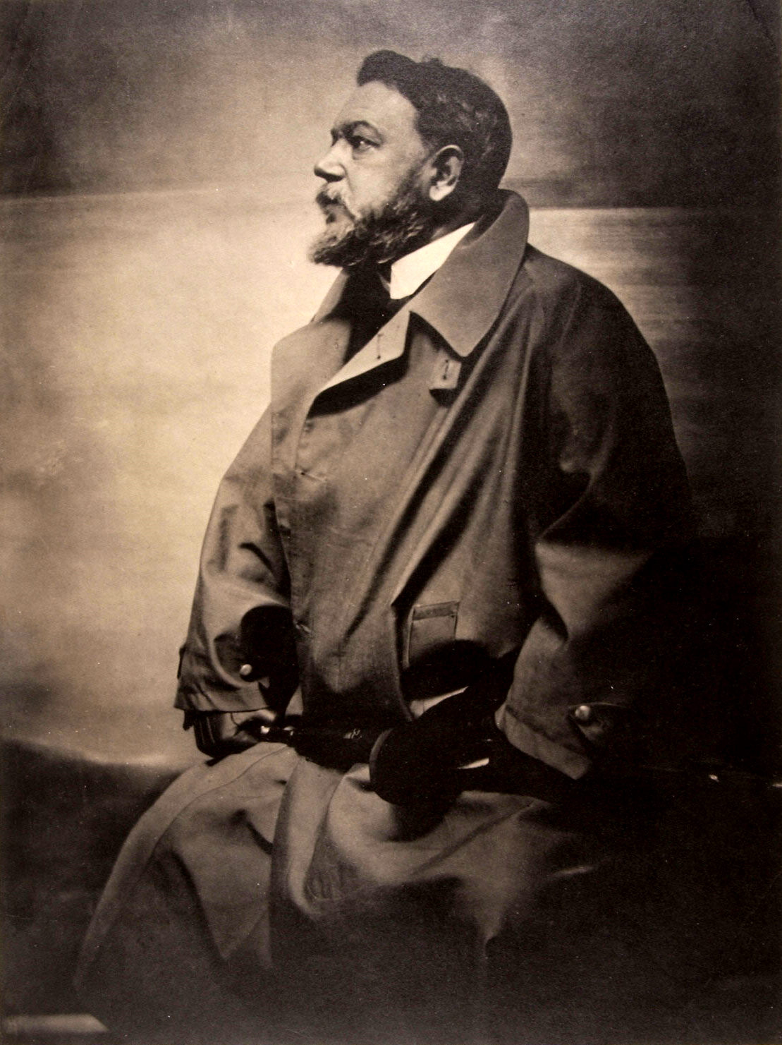
Charles is an ugly old guy, yes, but he isn't that splotchy.
So why make him look even worse than he looks in the early morning light just after crawling out of bed from a bender?
Because that is the Modern way.
Looking your best is old-school.
This is more “authentic”, according to the scurrying critics.
Plus, if you paint things bad and ugly on purpose, you can claim to be making some deep statement about politics or history or the human condition, blah blah.
Painting beautiful paintings that people might actually want to look at has been passe for over a century, since around the time John Singer Sargent retired.

John Singer Sargent (/ˈsɑːrdʒənt/; January 12, 1856 – April 14, 1925)[1] was an American expatriate artist, considered the "leading portrait painter of his generation" for his evocations of Edwardian-era luxury. He created roughly 900 oil paintings and more than 2,000 watercolors, as well as countless sketches and charcoal drawings. His oeuvre documents worldwide travel, from Venice to the Tyrol, Corfu, Spain, the Middle East, Montana, Maine, and Florida.
We are supposed to believe art has risen above such shallowness, now being more “relevant” and “realized”.
We have never been told why ugliness is more relevant than beauty, but there it is.
That is what you are supposed to believe to get your union card in the art markets.
You might also consider this:
if you are painting bad on purpose, you can write off any mistakes as part of that.
Accidentally bad and purposely bad look the same, don't they, so you can't tell the difference.
It is a great way to hide ineptitude.
They want you to think painting beautifully is easy and that painting ugly is hard, since it takes a lot of honesty and grit to paint ugly.
Upside down to the truth as usual.
You can pass off just about any failure of technique as gritty and Modern, but beauty is rarer now than it has ever been, since nobody knows any real technique.
Even in contemporary realism, almost everyone is tracing from slides and boosting all their colors in photoshop, which doesn't lead to beauty.
It leads to garish monstrosities like the one above, even in the best of circumstances.
What about the butterfly?
The mainstream outlets are lying to your stupid face, claiming it has something to do with Charles' environmentalism.
You have to laugh.
Others go just a baby step deeper, saying it has something to do with him being the “monarch”.
Monarch butterfly.
A step in the right direction, but still only one floor down in a rabbit hole with fifty floors.
Is that what Project Monarch was about?
Part of MKUltra?
It was about environmentalism?
It was something to do with the Monarchy?
No, it is a Phoenician symbol, like the bees, the Phoenix, and so on.
Part of all that, which Gerry and I have covered elsewhere.
Phoenicians: ANCIENT SPOOKS – Library of Rickandria
People are shocked by this latest portrait, but it is only because they haven't been paying attention.

This is what the royals and all the other rich and famous have been doing for a century.

So, it is not shocking at all.
It would be shocking if they went back to making and buying beautiful and interesting art.
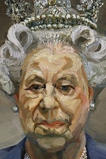
That portrait of the Queen is by Lucian Freud, perhaps the most famous and feted painter since WWII.
He is recently deceased, but his record at auction is already $86 million.
For stuff like this:
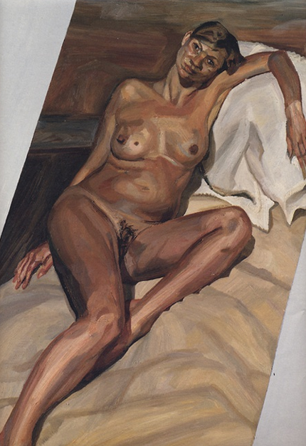
I bet you can't guess who that is.
Kate Moss.
Katherine Ann Moss (born 16 January 1974) is an English model.[6] Arriving towards the end of the "supermodel era", Moss rose to fame in the early 1990s as part of the heroin chic fashion trend. Her collaborations with Calvin Klein brought her to fashion icon status. She is known for her waifish figure, and role in size zero fashion. Moss has had her own clothing range, has been involved in musical projects, and is also a contributing fashion editor for British Vogue. In 2012, she came second on the Forbes top-earning models list, with estimated earnings of $9.2 million in one year.The accolades she has received for modelling include the 2013 British Fashion Awards acknowledging her contribution to fashion over 25 years, while Time named her one of the world's 100 most influential people in 2007.
Yes, really.
Was she really that bloated, stripey, stoned, wall-eyed and pin-headed that day?
No, but this is what the rich and famous apparently want from their art.
That is actually very tame compared to most of the stuff they have exhibited in their homes.
It is somewhat less repulsive than most of Freud's other paintings.
Just pick up some back issues of Architectural Digest and check out the homes of these people, concentrating on the art.

Andrew Lloyd Webber, Baron Lloyd-Webber, KG (born 22 March 1948) is an English composer and impresario of musical theatre. Several of his musicals have run for more than a decade both in the West End and on Broadway. He has composed 21 musicals, a song cycle, a set of variations, two film scores, and a Latin Requiem Mass.
Other than maybe Andrew Lloyd Webber, I haven't seen any of them who have actual art up.
The rest of it looks like an upscale hotel lobby.

For instance, that is a room in George Clooney's Lake Como mansion.
What pointless art, right?
A kaleidoscope?
But wait, what is in the center?
Our butterfly again.
And how ugly is that coffee table?

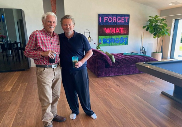
That's a sample of Matthew Perry's art collection.
That's not the interior you expected, I'll bet, to say nothing of the art—which is all that is worth saying about it.
But the exterior is just as strange:

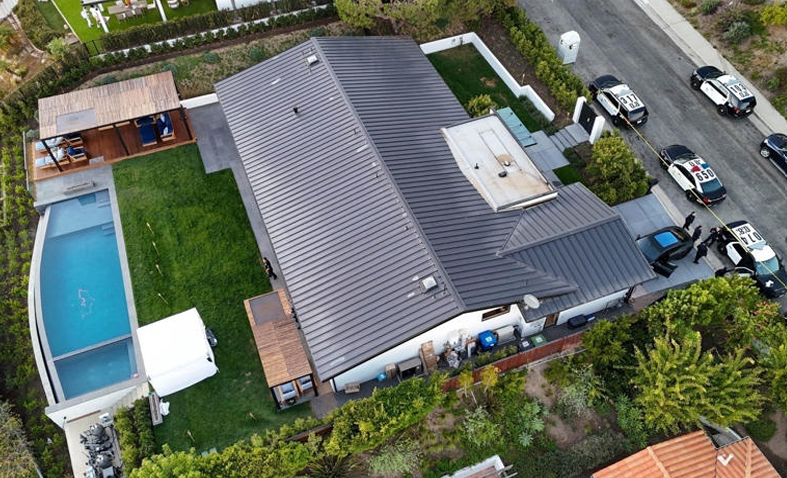
An 800sqft house on a 2000 sqft lot?
There is something we aren't being told about Matthew Perry.
But back to the matter at hand.
Jonathan Yeo has no real talent, so why is he so famous?
Must be a rich kid from the families, right?
Yep, his father Tim was a conservative member of Parliament for 32 years for South Suffolk.
He was John Major's Minister of the Environment and served in the Shadow Cabinet after that.
He was deselected in disgrace in 2015 for conflicts of interest as an MP.
Jonathan's mother is Diane Pickard.
Speaking of conflicts of interest, the artist Yeo got his first major break at age 30 when Yeo was commissioned by the House of Commons as the official Election Artist for the 2001 general election, and he painted the leaders of the three largest parties.
His triptych of Tony Blair, William Hague, and Charles Kennedy, entitled, 'Proportional Representation', was made up of canvases sized according to the subjects' popularity.
But wait, his father was a member of the House of Commons at the time.
Aren't there rules against such official nepotism?
It would be like Nancy Pelosi's son being chosen as the official Congressional photographer or something, with no contest coming in.
A sort of no-bid, no-merit contract.
And yet you never hear a peep about it.
So, who are these Yeos?
Are they peerage?
Yep.
They come out of Devon in about 1800, where they are related to the Balls and Satterlys.
George Washington was a Ball, remember.
Through the Pinsents they link us to the Todds of New York, which may link us to Abraham Lincoln.
In 1886 these Yeos hit the big time when one of them married the Baronet Cunynghame.
Guess who the baronet's niece was?
Only Pamela Stanley, daughter of the 5th Baron Sheffield and Margaret Gordon.
You knew that was coming, didn't you?
This also links us more recently to the Duponts and Watts, and therefore to the royal family.
The King is a cousin of the Watts and Gordons.
So now you know why Yeo was chosen.
Before this, Yeo was best known for his celebrity portraits and cosmetic surgery series.
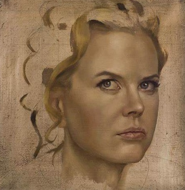
Yes, that does at least look like Nicole Kidman, but it is still amateur portraiture.
I note he has squared off the canvas on all his paintings, indicating he can't draw well freehand.
That indicates that at least computers aren't creating this.
Maybe he is painting these heads himself.
Other than that, I have nothing nice to say.
I note that he never finishes anything, just having these floating heads with either no background or a slapped-in mess.
Why?
Is it to be cool?
Is it to make a statement?
No, it is because working a figure into a background and making it look right is beastly difficult.
Very few people can do it and almost none even try anymore.
I have to think this is what gave him the idea for the cosmetic surgery series.
One of his buddies probably made a joke about all his work looking cut or cut-out, so he figured why not make a conceit out of it, saying his people were undergoing cosmetic surgery.
Surgery to have:
- backgrounds
- hair
- clothes
and all beauty removed, I guess.

That's his portrait of Kristin Scott Thomas.

Dame Kristin Ann Scott Thomas DBE (born 24 May 1960) is a British actress. A five-time BAFTA Award and Olivier Award nominee, she won the BAFTA Award for Best Actress in a Supporting Role for Four Weddings and a Funeral (1994) and the Olivier Award for Best Actress in 2008 for the Royal Court revival of The Seagull. She was nominated for the Academy Award for Best Actress in The English Patient (1996).
Can you believe how bad that is?
And yet His paintings are included within the permanent collections of the National Portrait Gallery, London, the Laing Art Gallery, Newcastle, The Museum of National History at Frederiksborg Castle in Denmark, and The Royal Collection.
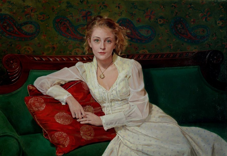
Just for fun, let's compare one of his best portraits to one of mine:

That is about as ambitious as he gets.
What's wrong with it, other than the obvious?

Well, he doesn't even know how to light a face for a portrait, to start with.
He apparently just uses photography lighting, evenly lit from both sides.
So, there are no shadows, no darks, and no real highlights.
That is the worst way to bring out depth in a face, supposing you wanted to.
It washes everything out, making the face look pasty.
He also doesn't know anything about color, since there is either no color variation, as here, or a big garish mess, as in the King Charles portrait and many others.
Although my girls are outside in full sun, they still have a lot more color in their skin than Kidman does.
Yeo seems to have forgotten the alizarin crimson on his palette, since Nicole doesn't even have red in her lips.
He has painted the whole head with about three colors:
- black
- white
- burnt sienna
Maybe a small amount of terra rosa in her lips.
He skips the hair, as usual, but here is a close-up of my hair:

I would never skip the hair, since it is one of my favorite things to draw and paint.
Very few painters paint hair like this, most painting it much tighter or much looser.
Either they take it just beyond a block-in, like Sargent, or they paint it photographically.
I don't do either one of those things, do I, though few have noticed.
The style is loose, but it is never just a block-in.
But let us return to the lighting.

That's just a small sketch, but I use it here as an extreme example of portrait lighting.
Joaquín Sorolla y Bastida (Valencian: Joaquim Sorolla i Bastida, 27 February 1863 – 10 August 1923) was a Spanish painter. Sorolla excelled in the painting of portraits, landscapes, and monumental works of social and historical themes. His most typical works are characterized by a dexterous representation of the people and landscape under the bright sunlight of Spain and sunlit water.
I learned that from Joaquin Sorolla and Torrents Llado, who were masters of it.
You would be taught to avoid shadows like that in any portrait photography class, but you can't get that mood without them.
Oil paintings can take you beyond photography, but only if you let them.
They have their own inner rules that photographers and Moderns don't know about.
As just the most obvious thing, it is clear to me that Yeo doesn't even know what paints to buy.
His paint looks like garbage, ignoring everything else.
He isn't using traditional materials or if he is he doesn't know how to use them.
Like John Currin but much worse.
Currin Again by Miles Mathis (mileswmathis.com)
Currin is at least an interesting illustrator, where Yeo isn't even that.
You will say,
“So what, so you are better than Yeo.
Get over yourself.”
The so what is that while Yeo is rich and famous, painting kings and queens and movie stars, most of my best work has never even been seen in a gallery.
That big painting of the two girls has never been out of my house, and it isn't because I am hogging it for myself.
It is because the market for good work has been completely destroyed.
Nobody can tell the difference.
It is now just a bunch of rich people's kids jacking themselves off, as we saw here with Yeo.
It is a huge circle-jerk of untalented assholes buying all promotion for themselves and burying people like me on purpose, so they don't have to compete with us.
I Would Like to File a Suspicious Transactions Report on the entire 20th century – Library of Rickandria
I have been waiting for someone to take up my defense for thirty years now, and I can see it isn't going to happen.
The CIA & Art – Library of Rickandria
There are no critics, connoisseurs, or experts worthy of the name left in the world.
As in science and history, the field is stone-dead, so if someone is going to speak out it is up to me as usual.
If I don't tell you who I am, nobody is.
You will say that I don't want to paint kings and movie stars, so what am I complaining about?
No, but I don't want to be buried in obscurity, either.
Some have said I don't make an effort, but that isn't true.
Before I understood who these people are, I sent a portfolio to Buckingham Palace addressed to Prince Charles.
I had read he was a supporter of artists, so I thought he might be interested.
It was after I painted my Shelley Altarpiece, and I included slides and a full description of that as well as my other major works.
Triptych (mileswmathis.com)
I thought it would be fun to have a prominent show in London, where that work should be seen.
No response.
Crickets.
Same response I have always gotten everywhere, and that was before I started writing.
They weren't ignoring me back then because I was attacking them, they were ignoring me because I wasn't a close cousin and a Modern.
I wasn't peerage or social register, so I was a pre-defined nobody.
I wasn't being judged by my works; I was being judged by my bloodlines.
What I Finally Understood about Famous People – Library of Rickandria
All promotion is reserved for their own children.
Star Salaries are Fake – Library of Rickandria
It was the same thing when I lived in Taos for fourteen years.
I had had decent representation there from 1993-2000, being at the prominent Quast Galleries, so when I moved there from Europe in 2007, I expected to fit in somehow.
The Quasts had moved to horse racing, but the town was still full of galleries.
But by then it was being taken over by the Moderns and these social register people (and their CIA cohorts).
They had infiltrated the old Harwood Museum downtown and would soon be pushing Meow Wolf and the local Paseo.
I ran a prominent ad in the local paper to let them know I was back, but didn't get one call.
I sent portfolios to the Harwood, the Fechin, Parsons Gallery, A Muse, and other galleries, and got nothing but ice.
The traditional galleries were all busy dying and everyone else was clamoring to go Modern.
The Harwood brought in Dennis Hopper and his fake artist buddies for a celebrity slurpfest in 2009, and they and their hired critics spent weeks in the local papers and in seminars and interviews slandering the traditional artists that had made Taos what it was.
I responded, tearing them all to little shreds as is my specialty, and sealed my fate in Taos.
letters to the editor from the artist Miles Williams Mathis (mileswmathis.com)
Word came down from the top that I was to be blacklisted.
Over the next decade, Modernism failed to gain any real foothold in Taos, since the locals had no interest in it.
Neither did the patrons of realism, who now abandoned Taos.
They quit coming and dozens of traditional galleries went under.
So, they had successfully killed Southwest realism or any other sort of realism in Taos, but it hadn't been replaced by anything.
Only two Modern galleries opened and they did no business, having zero foot traffic.
This of course affected the rest of Taos tourism, which also took a steep dive.
Taos no longer had its famous gallery scene, so its only calling card was the ski valley.
That was also taken over by some billionaire crook, and I am sure he will find a way to drive it into the ground.
And so, it goes.
The New World Order.
But did I curl up and die?
No, I thought if they want a fight, I will give it to them.
But I didn't attack the locals (or not much).
I went for bigger fish.
Dennis Hopper was dead within the year after my attack on him, and though I don't claim credit for it, I do point out the timing.
Dennis Hopper by Miles Mathis (mileswmathis.com)
I simply point out that although they tried to crush me, the crushing appears to have gone in the other direction, for whatever reasons.
Same for the critic Dave Hickey, who went into a physical and career tailspin soon after my truth-telling on him.

David Hickey (December 5, 1938 – November 12, 2021[2]) was an American art critic who wrote for many American publications including Rolling Stone, ARTnews, Art in America, Artforum, Harper's Magazine, and Vanity Fair. He was nicknamed "The Bad Boy of Art Criticism"[3] and "The Enfant Terrible of Art Criticism". He had been professor of English at the University of Nevada Las Vegas and distinguished professor of criticism for the MFA program in the Department of Art & Art History at the University of New Mexico.
Dave Hickey by Miles Mathis (mileswmathis.com)
I cut him down to size and he appears to have felt it, far beyond anything I was feeling from their blacklisting.
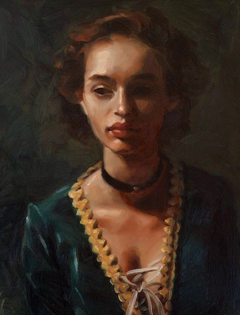
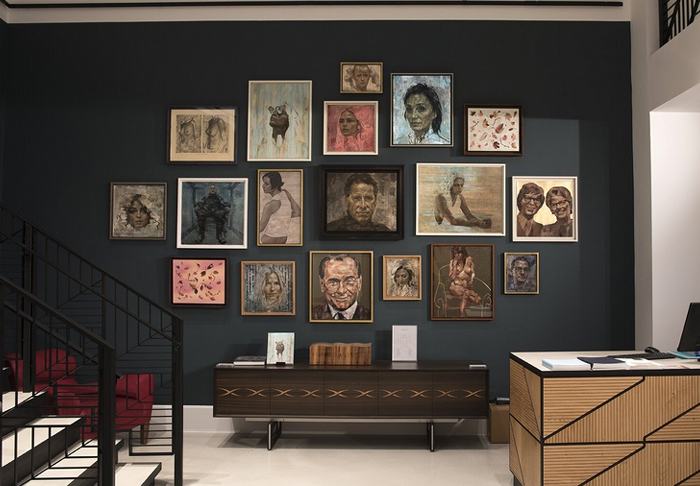
So, let's do another side-by-side:

Seeing the paintings on the walls may help.
That first one is from his website, and you can see how piddly the works are.
Even the frames are cheap crap.
Although I have almost no income, I find a way to frame my work right.
That biggest painting on my wall is over 7 feet tall with the frame.
Imagine what those works would look like in a proper gallery, with the right lighting and all that.
Now let's move in:

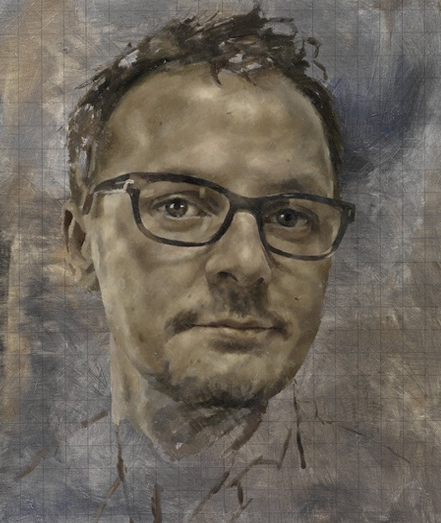
His self portrait and mine.
Even while looking at himself for three years in the mirror, I guess he didn't notice his glasses were cattywumpus.
And again, his palette appears to be about four colors, and he needed only two for the skin tones.
It really couldn't be worse, except–as with the King Charles thing —maybe it does capture his spirit.
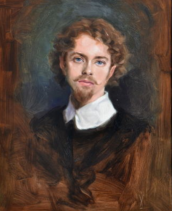
I dressed in that collar as an homage to Van Dyck, one of my heroes.
And yes, I did have that handlebar mustache at the time.
And yes, I did paint those flourishes on the frame as well.
We will zoom in so you can see the brushwork and color better:
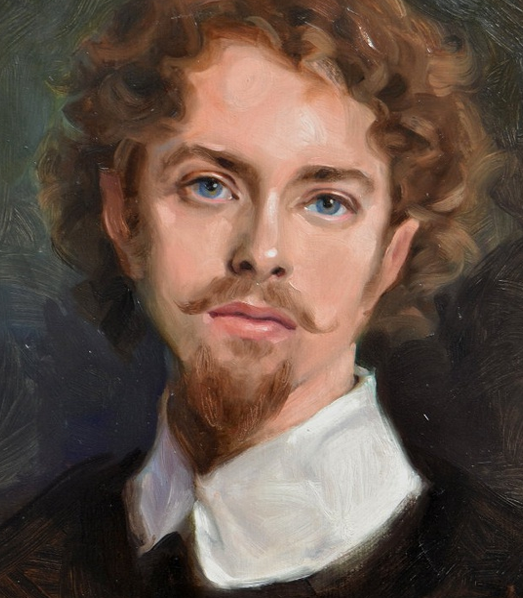
That brushwork is called bravura.
Because it's fast and you just let it stand.
You can see the brush moving, and it is minimally blended on purpose.
It is lifesize, but it only took a few hours, being a big sketch, dashed in while looking in the mirror.
One of very few self-portraits I have ever done, because —contrary to popular opinion—I am not much interested in my own face.
I see enough of it while brushing my teeth, etc., and don't really need to paint it as well.
You can see that Yeo is shooting for some sort of bravura looseness himself, he just isn't up to it.
He has just created an ugly mess with no real virtuosity of brush or anything else.
Sorry, but he set himself up for this.
All these people deserve much worse than anything I could post on them.
One thing that makes mine far more pleasant, other than the obvious, is that I am using a full range of color on the palette and a full tonal spread.
The blue green in my eyes is supported by blue and green in the background.
We have:
- yellows
- reds
- blues
- violets
and greens.
But they are in the painting subtly, not garishly, right out of the tube.
They have been grayed out to just the right shade, so that they all go together.
And we have all shades of light and dark from bright white to black.
Yeo doesn't have any of that going on, as you see.
And although this is just a sketch, I have been able to softly work myself into that background.
I don't just paint up to the edge of my face and stop, do I?
That is because I am highly aware of all edges, meaning I don't blend everything the same.
I blend some lines more than others, because all edges are different.
In more finished portraits of mine you will see that even more.
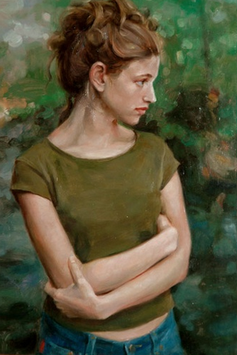
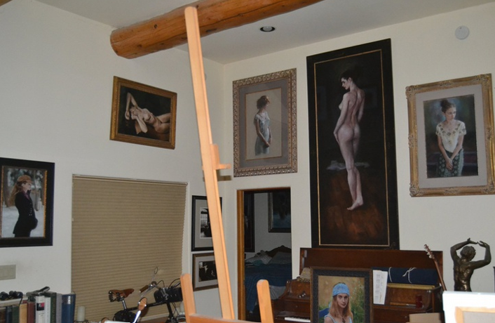

That first one is Yeo's fellow artist and Turner Prize winner* Grayson Perry.

Sir Grayson Perry CBE RA Hon FRIBA (born 24 March 1960) is an English contemporary artist, writer and broadcaster. He is known for his ceramic vases, tapestries, and cross-dressing, as well as his observations of the contemporary arts scene, and for dissecting British "prejudices, fashions and foibles".
Which opens a whole other can of worms I don't feel like getting into.
You can look him up if you need to, but not after eating.
Many wonder how far away we are from his Jimmy Savile moment.

Sir James Wilson Vincent Savile OBE KCSG (/ˈsævɪl/; 31 October 1926 – 29 October 2011) was an English media personality and DJ. Savile was well known in the United Kingdom for his eccentric image, charitable work, and hosting the BBC shows Top of the Pops and Jim'll Fix It. After his death, hundreds of allegations of sexual abuse made against him were investigated, leading the police to conclude that he had been a predatory sex offender and possibly one of Britain's most prolific. There had been allegations during his lifetime, but they were dismissed, and accusers were ignored or disbelieved.
But here I am posting it for the technique.
It's just really bad painting, isn't it?
It is all shades of pink and sienna (which don't go together to start), with no tonal or color range, and everything but the face and arms just blocked in clumsily.
It's all a huge washout, literally, and you can really tell that when it is right above my portrait of Mia.
That isn't a great photo of my painting**, but even so you can see what I was talking about with tonal and color range.
Unlike Yeo's painting, mine has lots of luscious darks in it, to help give it depth.
It has those rich reds and greens that play off each other, since the two colors are complements.
And the skin tone fits the rest of the color scheme.
All of the colors fit together because they were chosen to do so.
Nothing here is an accident. I actually know how to use my palette and my brushes.
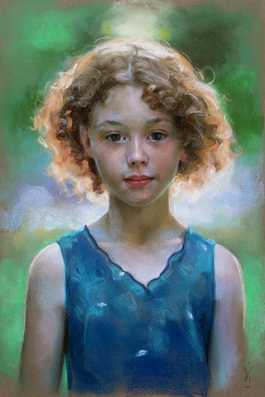
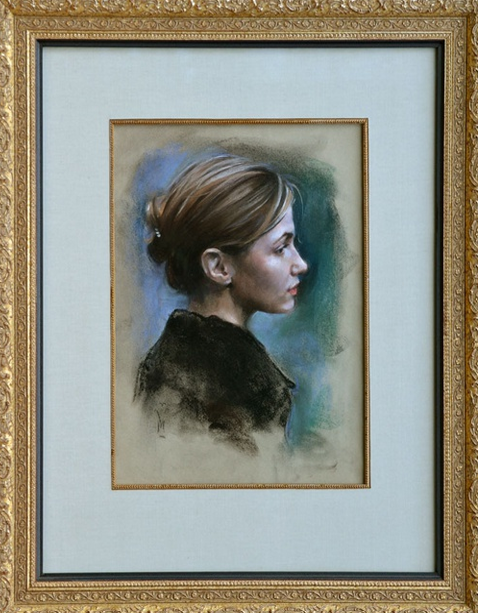
You will say I sometimes vignette my smaller works, as here:

Yes, I do, especially with pastels.
Those are both pastels.
Colored chalks.
Vignetting means I fade them out rather than draw all the way to the edge.
It seems to me the Yeo would like to be able to do that, since it is considered appealingly loose and expressive.
But it has to be done gracefully, not lazily and clumsily.
I don't just slap those areas in willy-nilly, you know.
I am very particular about my backgrounds, even at times like this.
Even the messiness has to be a beautiful mess, otherwise it is not art.
Everything is exactly where I want it to be, and it goes there because I am smudging all those areas with my fingers, using my hands as a paintbrush.
Every smudge and blend are purposeful.
Every smudge has a direction and a pressure and a curve.
Just look at all the colors in the background of the first one, for instance.
At least four different greens and three blues, and a couple of purple grays.
And you can see:
- vertical strokes
- horizontal strokes
- diagonals
and zigzags, all mixed together.
Those strokes aren't just strokes of the pastel; they are strokes of my fingers.
It is just a sketch, yes, but it is actually very complex.
Look closely and you will see the skin has both reds and blues in it.
Those highlights in the skin are actually done with light blue chalk.
Yeo has apparently never considered the possibility skin has blue or green or violet in it.
He is never working cools against warms, much less balancing the entire work like this.
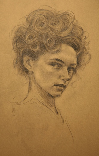
All this is made possible by drawing:

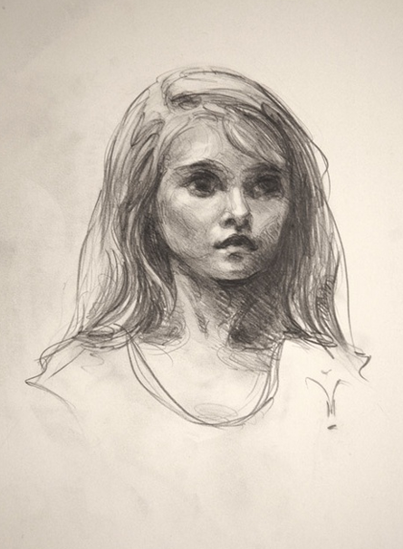
I know the difference between a beautiful line and an ugly line and Yeo doesn't.
He doesn't have any conception of these things I am talking about.
He is just fitting his lines to his grids, trying to accurately copy his photos.
Any beauty would be death to his career as a Modern, so why would he concern himself with it?
If he stumbled across a beautiful line, he would probably avoid it as a nuisance, blotting it out immediately.
Same thing for any color balancing, composition, or any other subtlety.
Subtlety doesn't pay, you know, since all those who could see it are extinct or voiceless.
What pays is already being peerage or social register.
If you are that, nothing else matters.

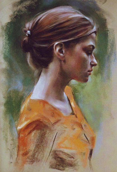
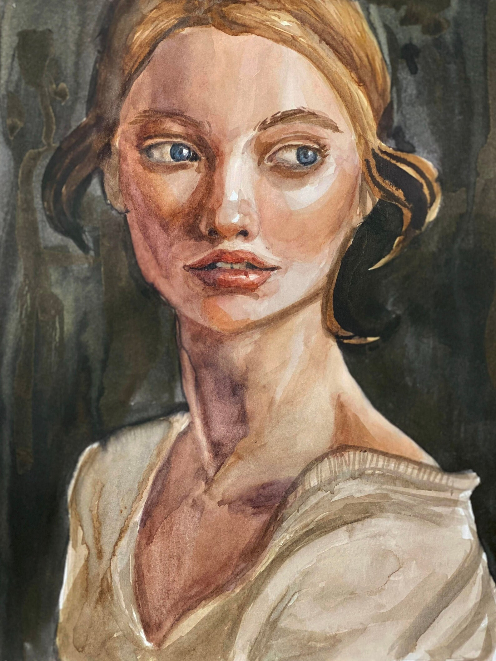
What's that?
That's not one of mine, is it?
No, it's not.
That was recommended to me by the search engine while I was searching on Yeo, along with a lot of other stuff.
I keyed on that and maybe you can see why.
It's just a little watercolor, but I think the artist hit a homerun with it.
It was up at Etsy for $45, with no attribution.
Portrait Watercolor, Painting Girl, Medium Painting for Interior, Watercooler Painting, Original Portrait Wall Art - Etsy
Free shipping!
I don't know who the artist is.
But I bought it anyway.
I think I can afford $45 to support a fellow artist.
The seller tells us it is signed, so I will know the artist when I get it, I guess.
And yes, it is supposed to be an original on paper, not a print.
I find it far more interesting than anything the great Jonathan Yeo has ever done.
Why?
Because it successfully creates that psychological charge, that Modern angst, he tries and fails to capture.
The roughness of the technique actually adds to the emotion, as the Moderns always claim but almost never deliver.
You can feel what that girl is feeling.
If the technique were more refined (prettier), you would feel it less, since what she is feeling is rough.
But let's wind this down.
Many readers probably hoped I would comment on the Satanism claim.
As you see now, the portrait of Charles is an abomination without that.
Just so you know, I don't think Baphomet is in the background, as they are claiming at Infowars and other places.
And I don't think the red is meant to symbolize blood.
That would be a bit obvious, even for the Phoenicians.
Yeo has used that color scheme in many previous works, and none of them look Satanic to me.
It is just a color he likes.
It makes him seem bold while drowning out all his mistakes.
It is like adding a loud soundtrack to a terrible movie.
Of course that doesn't mean these people aren't very bad news.
They definitely are, and I have proved that like no one else has.
They have been pillaging the world for at least 4000 years and show no signs of stopping.
So, whether or not they have an evil god behind them, you should be resisting them with everything you have, every fiber of your being.
If you get blacklisted, just use the extra free time to double and treble your attacks.
Added May 23, 2024:
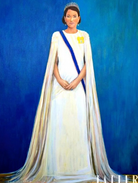
Tatler has now unveiled a new portrait of Kate Middleton by Hannah Uzor, which confirms everything I say here in spades.

It is being universally panned and you can see why.
Actually, far worse strictly as a matter of technique than Yeo's portrait of the king, since it is amateurish in the extreme, and bears no resemblance to her.
That's a high school level of painting, if that.
We are told Uzor just graduated from the Slade School, so I thought the problem might be that she was about 25, but no, Wikipedia tells us she is 42.
Her original degree was in computer science, but she decided to be an artist late, I guess.
She won a drawing prize at Slade, which is pretty hard to believe.
Or, no, it actually isn't hard to believe since the Slade crashed and burned about the time of Whistler, in the 1870s.
I remember him making fun of the place in his The Gentle Art of Making Enemies.
Turns out Uzor is another quota hire, being a black woman from Zambia.
Looks like a rich black woman from Zambia, so best guess is she is some sort of royalty, with bloodline connections to the British Royals perhaps through their Jewish lines?
Who knows?
Not much information on Uzor is available online.
We do find that Uzor previously painted Queen Victoria's African goddaughter Sara Forbes Bonetta, so there may be some link there.
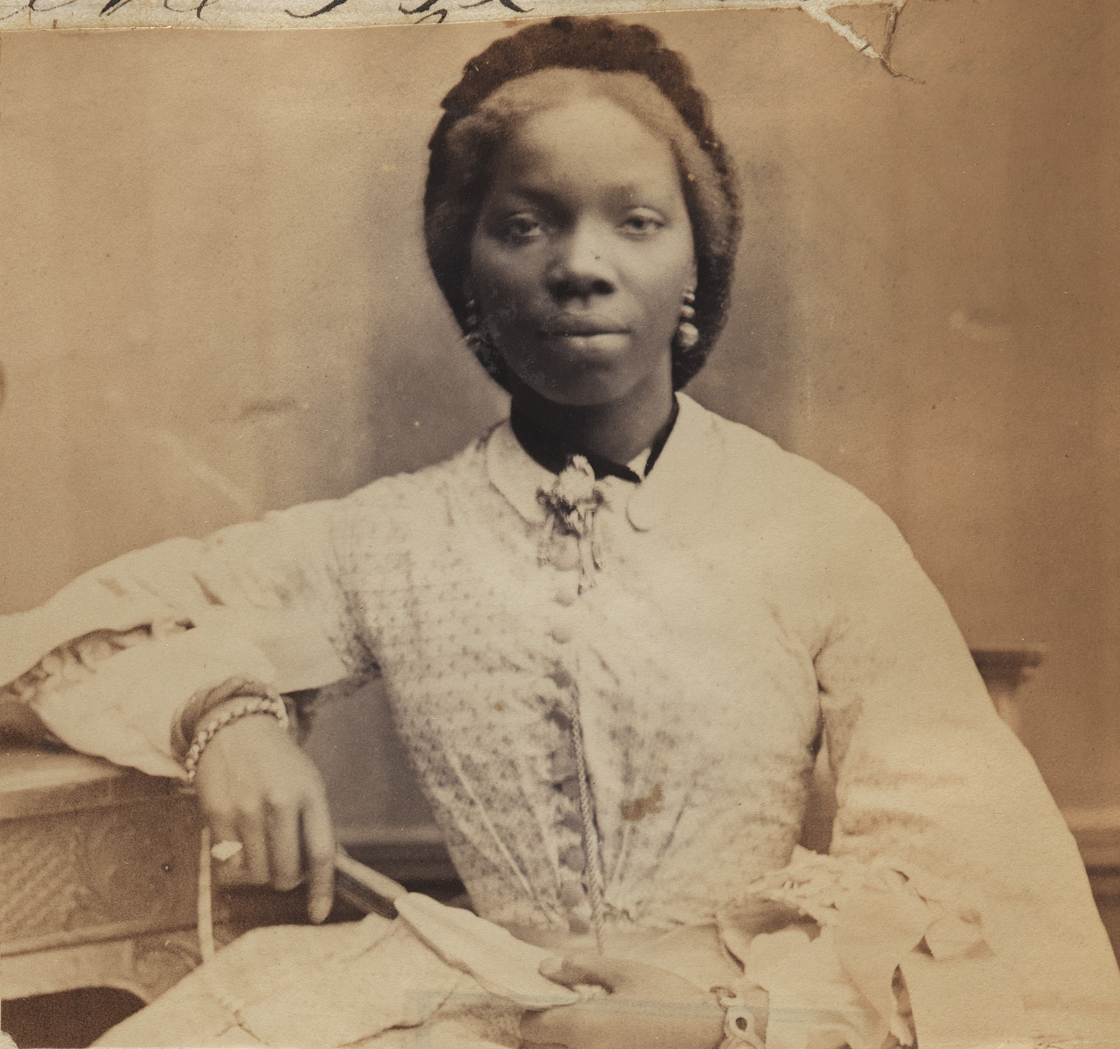
Sara Forbes Bonetta, otherwise known as Sally Forbes Bonetta, (born Aina or Ina; c. 1843 – 15 August 1880), was ward and goddaughter of Queen Victoria. She was believed to have been a titled member of the Egbado clan of the Yoruba people in West Africa, who was orphaned during a war with the nearby Kingdom of Dahomey as a child and was later enslaved by King Ghezo of Dahomey. She was given as a "gift" to Captain Frederick E. Forbes of the British Royal Navy and became a goddaughter of Queen Victoria. She married Captain James Pinson Labulo Davies, a wealthy Lagos philanthropist.
We are never told why Victoria all but adopted these Creoles of West Africa, but of course the best assumption is that someone got someone pregnant, and we are looking at more cousins here.
The Tatler cover is one in a series created in collaboration with Akoje Gallery, which is promoting African artists.
Akoje Gallery
Akoje claims it is,
Our goal is to give these artists the global platform they deserve, helping to elevate their voices and share their unique perspectives with a wider audience.
Sounds great, except maybe for the word “deserve”.
Did Uzor really earn this global platform, or are these artists being promoted way beyond their abilities?
Akoje is owned by Khalil Akar, who isn't even African:

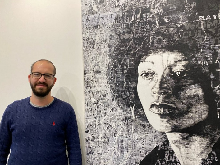
He's an Arab, and I'm guessing part Jewish, since the gallery world is owned by Jews.
So, what is he doing promoting blacks exclusively?
Do you think it might tie into everything else in the world going on right now?
Do you think Akar might be trying to cash in on the DEI project, selling his clueless clients diversity as the newest novelty?
Nah, couldn't be that.
And I guess you recognize that black lady next to him?
No?
Angela Davis, phony actress and CIA agent whom I expose in my paper on Jonestown.

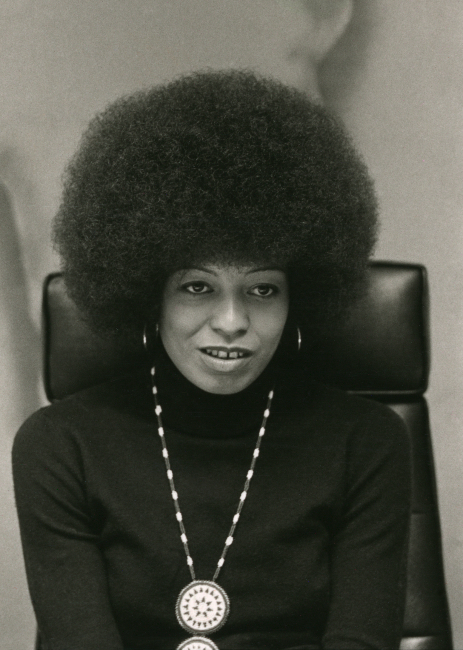
Angela Yvonne Davis (born January 26, 1944) is an American Marxist and feminist political activist, philosopher, academic, and author. She is Distinguished Professor Emerita of Feminist Studies and History of Consciousness at the University of California, Santa Cruz.[3] Davis was a longtime member of the Communist Party USA (CPUSA) and a founding member of the Committees of Correspondence for Democracy and Socialism (CCDS). She was active in movements such as the Occupy movement and the Boycott, Divestment and Sanctions campaign.
San Francisco & Jonestown – Library of Rickandria
So, he is continuing to sell all that fake history.
That by itself takes us another flight down the rabbit hole, suggesting this whole thing is tied to CIA/MI6.
I will probably be accused of racism for this, but that is a misread.
I have nothing against black artists.
One of the top realists in the world is Dean Mitchell, and he probably agrees with me here.
Home | Dean Mitchell, Watercolor Artist (deanmitchellstudio.com)
He can paint circles around both Uzor and Yeo.
He has progressed on talent and hard work.
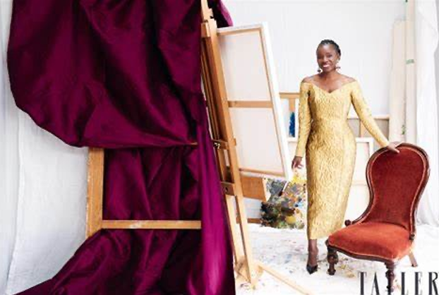
What else can we learn from that picture of Uzor painting in a gold dress from a velvet chair?
Well, if that is her real studio, we can see what sort of cheap canvases she uses.
That's a pre-stretched cotton canvas with thin pine bars, of the sort you can get for about $30 at Michael's in the States.
Given her level of technical mastery, it was exactly the sort of thing I expected to see her painting on.
She obviously has no clue what she is doing, and that is because they don't teach classical technique anymore, at Slade or anywhere else.
They all went Modern decades ago—or in the case of the Slade, 150 years ago.
Actually, that's not altogether true.
In the past 25 years a few private schools have opened up, including Jacob Collins' Atelier in New York and the Florence Academy in Italy.
But surprisingly, there are more of them in the States than in Europe.
Europe is still more Modern than the States.
So, it isn't surprising that Uzor couldn't find anyone to teach her how to paint.
But it apparently didn't matter anyway:
she had the connections, which are far more important than ability or knowledge.
Just so you know, I don't paint on canvases like that.
I paint on heavy linen, sized with rabbit skin glue and primed with Old Holland Cremnitz White (lead).
My stretcher bars are generally twice that big, and the ones for the largest paintings have to cut and mitered by hand, since they aren't commercially available.
That is just one of a thousand reasons my paintings look like they do in person.
How empty is her studio?
All white with no other works in it.
We see paint on the floor, but painting in this style doesn't create paint on the floor.
That's a modern thing.
There is no paint on my floor.
I don't even need a drop cloth.
So, I think they are filming in some generic studio.
They borrowed someone else's drop cloth.
And it took a hint from a reader, but I finally noticed the color of the velvet drape they have wound through the back of the easel for no reason.
Phoenician purple!
Oy vay.
Uzor admits that portrait took her just three weeks.
In a way that admission is refreshing, after seeing Yeo claim his portrait took three years.
Except that Uzor's portrait looks like a rush job.
She clearly needed to take a lot longer on it, and we can't understand why she didn't.
If I had been hired to paint a Princess and future Queen Consort, I think I might have requested the time to do a good job, whatever that was.
I will be told the portrait is so bad because Uzor didn't have Middleton sitting for her.
Tatler hired her and she had to work from photos.
I guess we are supposed to believe she made up the dress out of her head.
But that isn't how it works.
A good portraitist could produce a painting lightyears beyond this, even without any sittings.
I will tell you how it is done.
There are thousands of professional photos of Middleton, and though Uzor couldn't just copy one that had already been published, she could have bought the rights to an unused one.
Tatler's photo editor should have been able to help make the contacts.
Using that photo would give her the head, so all she has to do is hire a model the same size as Middleton, slap that dress on her, and then have the model either stand or take a photo and work from that.
A good portrait painter can switch out heads with ease.
Uzor could have done the same thing with the background, buying a nice curtain or other swatch to put back there.
Or she could have photographed her model in front of a nice tapestry somewhere, in a church or museum.
But she was too lazy or uncreative to do anything like that, not even bothering to learn to paint backgrounds.
Look at the way she has painted that solid blue, with all strokes going vertically, and hardly any tonal changes.
Boring!
I can tell the paint is thin and has soaked into the canvas, which is why it would look even drabber in person.
That simply isn't how a professional paints backgrounds, not even solid blue backgrounds.
*
For a vase with scary children on it.
I have written before about why my paintings are impossible to photograph.
People tend to dismiss that as rationalizing. . . until they see them.